Impulse buying
You surely know the feeling: you go shopping at your favorite supermarket, you've spent weeks painstakingly mapping it out, and now you finally know where to find everything. Vegetables here, bakery over there, something for the evening in front of the TV right here. Which makes it all the more annoying when, one day, you walk in and suddenly everything is different. Your painstakingly built mental map is turned inside out and you're back to square one.
The last time I went through this experience, I couldn't help myself and started googling: "Why do grocery stores rearrange everything?" I found countless articles explaining the phenomenon that's probably best captured by the term "impulse buying." To make it easier to grasp, I'd put it as an equation: the amount of goods a person sees while shopping is directly proportional to the amount of goods the customer takes home. Maybe now you understand why I'm dragging grocery shopping into an article about dark patterns. Because rearranging the assortment in stores is also a kind of dark pattern — an unfair method by which its author tries to manipulate their victim into doing something they may not actually want to do.
What does a dark pattern look like?
Now that you know what a dark pattern is and what it's for, let's look at a few examples from practice. It's possible you've already encountered many of these dark patterns without realizing it. Dark patterns often aren't as obvious as an out-of-the-blue rearranged store. The very first one we'll break down actually can't be seen at all — but once you learn about it, you'll see it everywhere.
(Disclaimer: Due to lawsuits or community feedback, the specific named examples may no longer be current. Treat them more as model examples.)
Roach motel
The name "Roach motel" would probably make more sense to you if you lived in the United States. That's what they call a cockroach trap there — insects get in easily through a small gap that's designed so that the way back is practically impossible.
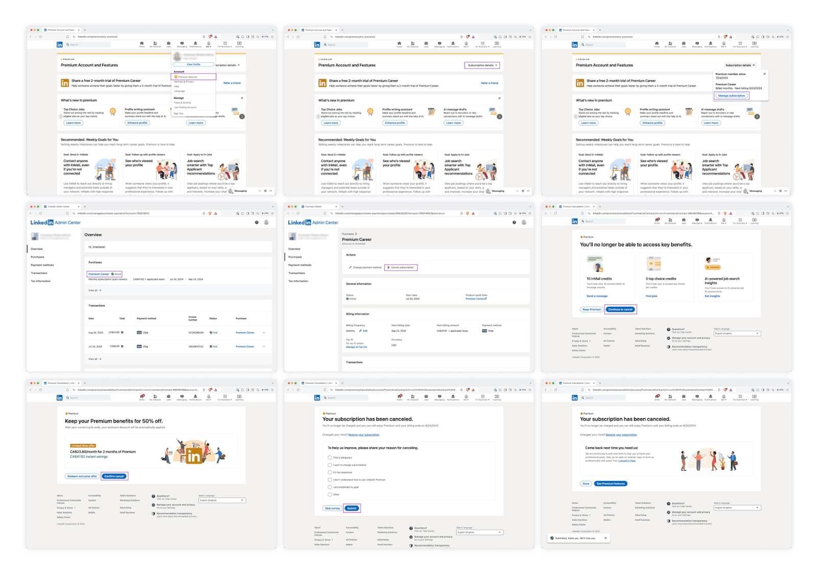
Our first dark pattern works similarly. It lets the user sign up for a service or subscription almost too easily, but cancelling it requires at least patience, and in worse cases even advanced knowledge of the website's layout. As an example, here's the process of cancelling LinkedIn Premium.
Hidden subscription
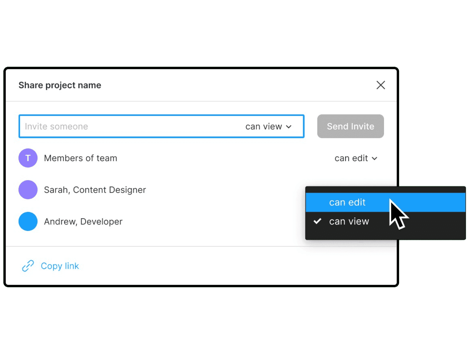
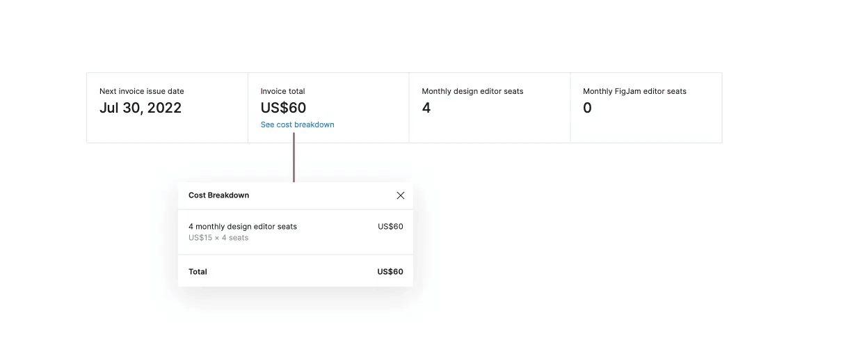
A hidden subscription is a dark pattern in which the user signs up for a subscription that isn't announced in any way beforehand. In the example below, the subscription is activated when an organization's admin grants editing rights on a file to another person. That's all they do. They only find out they're paying for one extra "editor seat" from the invoice. The cherry on top is that the invoice doesn't list the specific email accounts, which further complicates the process of "spotting the mistake."
Confirm shaming
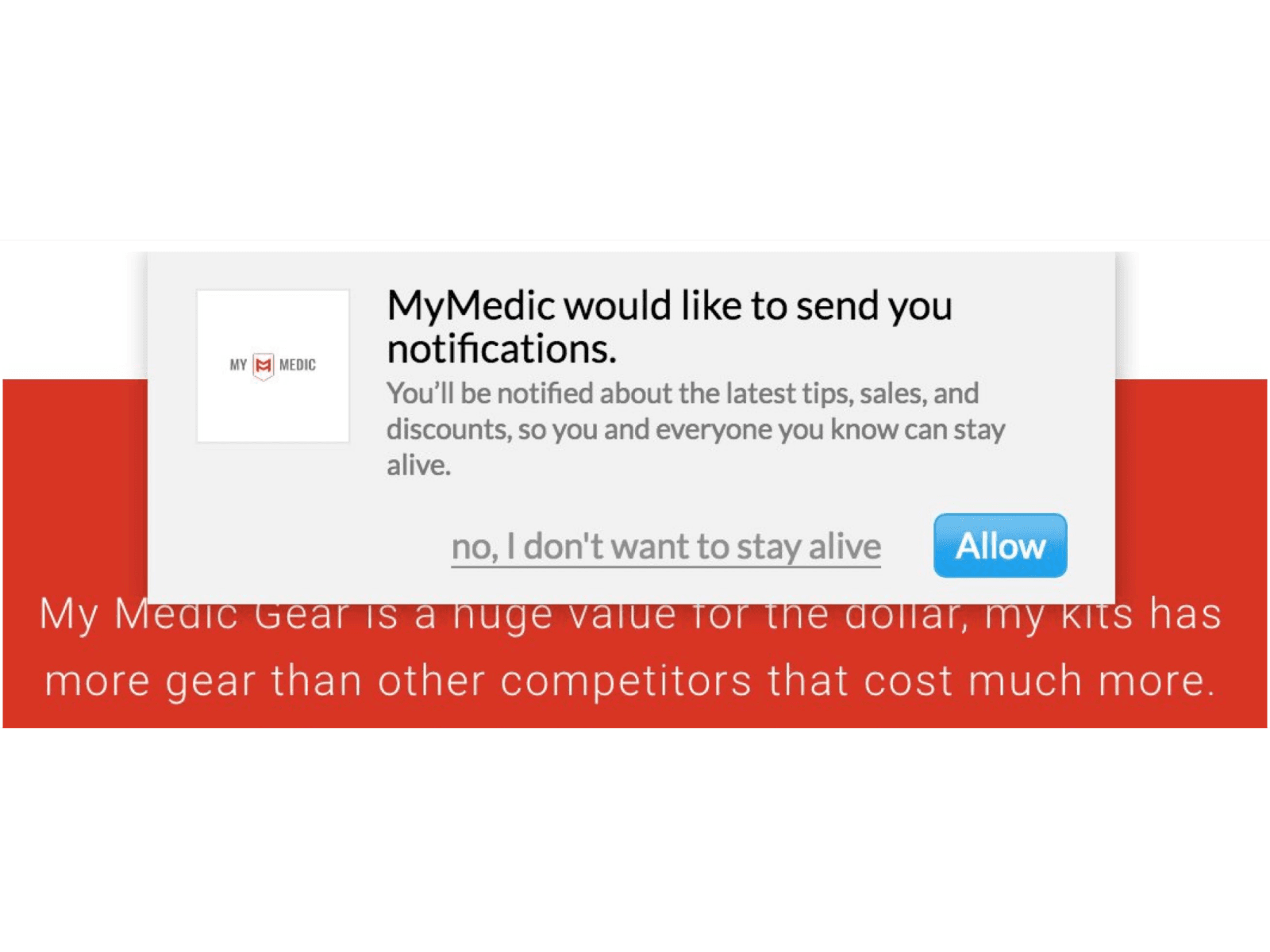
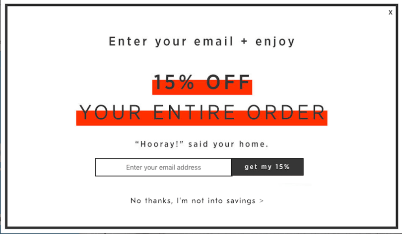
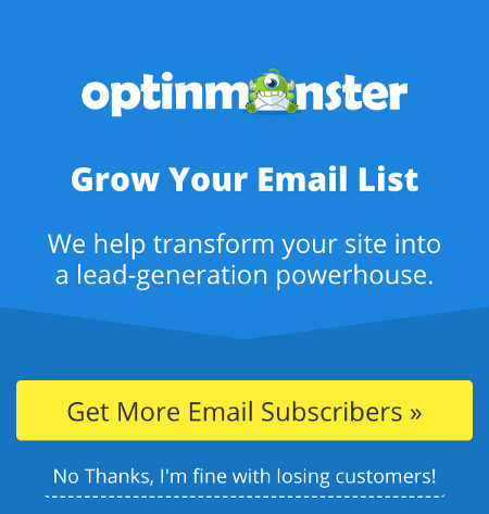
Confirm shaming is one of the more entertaining dark patterns. Its goal is to make the user feel guilty as punishment for being about to perform an action that doesn't quite suit the service operator. In the "ideal" case, the bad feeling is supposed to make the user reconsider — but data shows this isn't the most effective form of manipulation. Users simply get used to such obvious tricks, and when they encounter them they don't have much trouble ignoring them. The inventiveness of the creators of these manipulation attempts sometimes knows no bounds.
Tricky wordplay
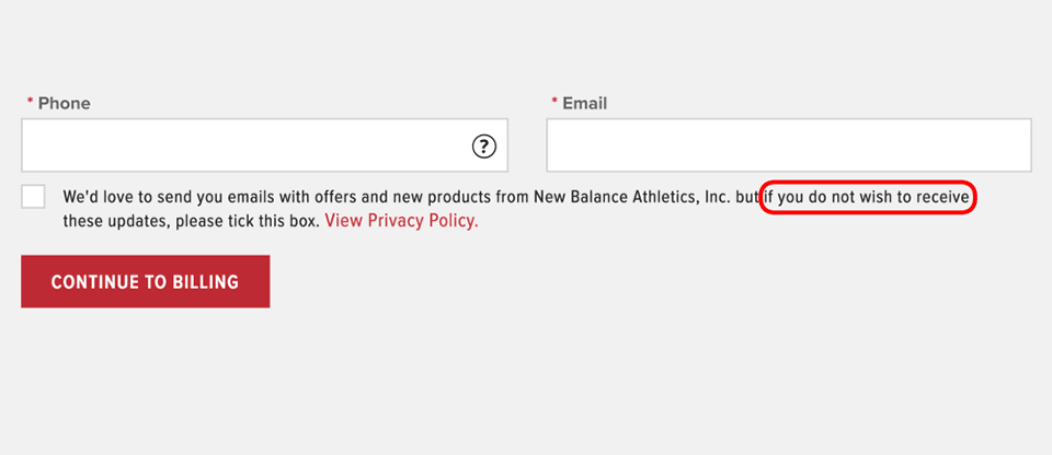
Devious play with words. When implementing this dark pattern, its creator assumes the user won't understand the deliberately misleading text and, for example, subscribes to a newsletter believing they've just unsubscribed from it. Another example might be a dialog box confirming account cancellation that offers two options: "Confirm" and "Cancel." Which one actually leads to cancelling the account is often known only to the person who programmed it that way.

Disguised ads
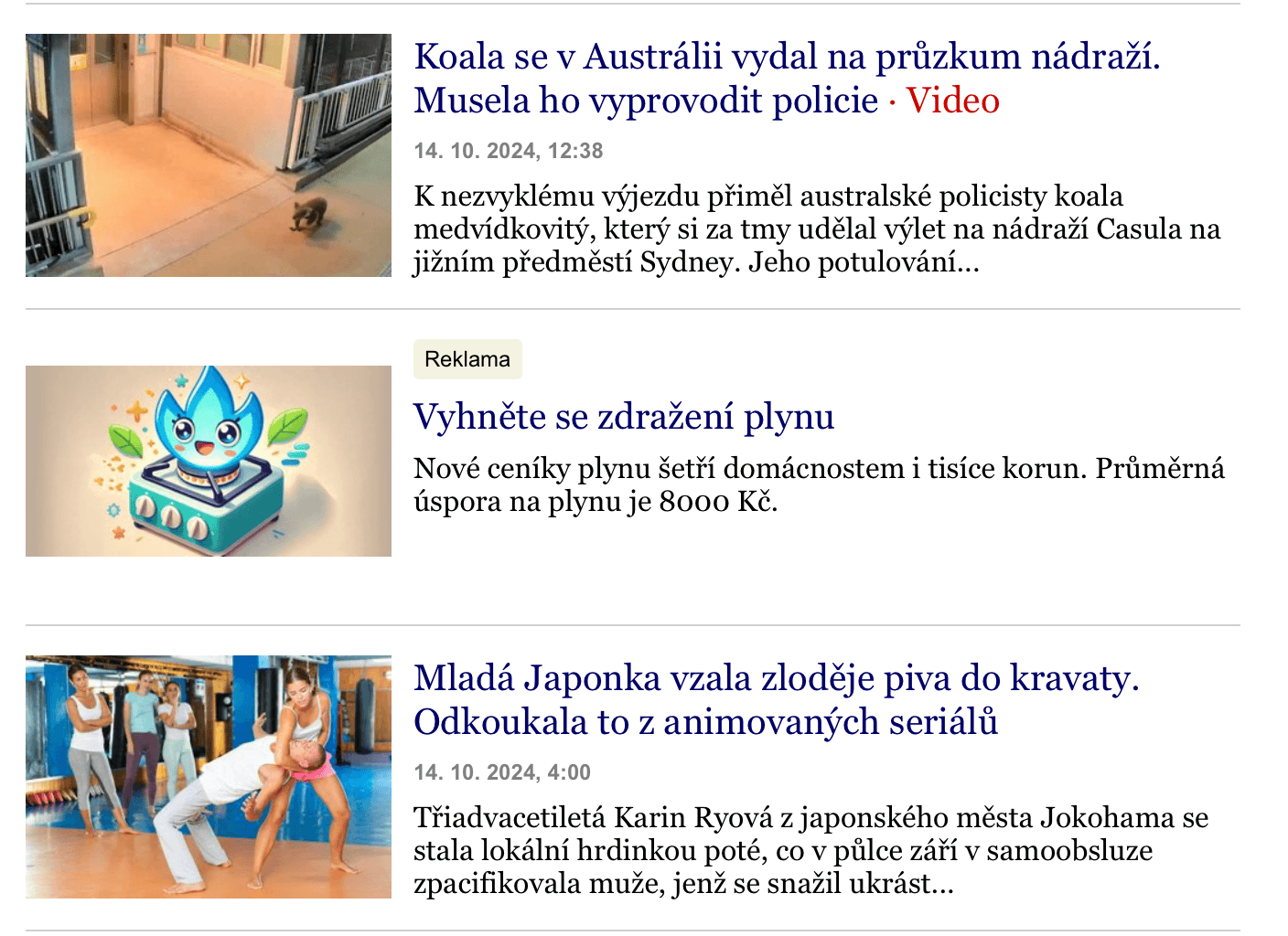
Disguised ads have evolved quite a lot over the past few years, and in my experience it's the dark pattern I come across most often. You can picture it as an ad that blends perfectly with the rest of the page, often pretending to be part of it and thus confusing users who think they're interacting with the app's content while they're actually clicking a link leading to a third-party website. A good example is an ad that pretends to be a preview of an article on a news site.
Fake urgency
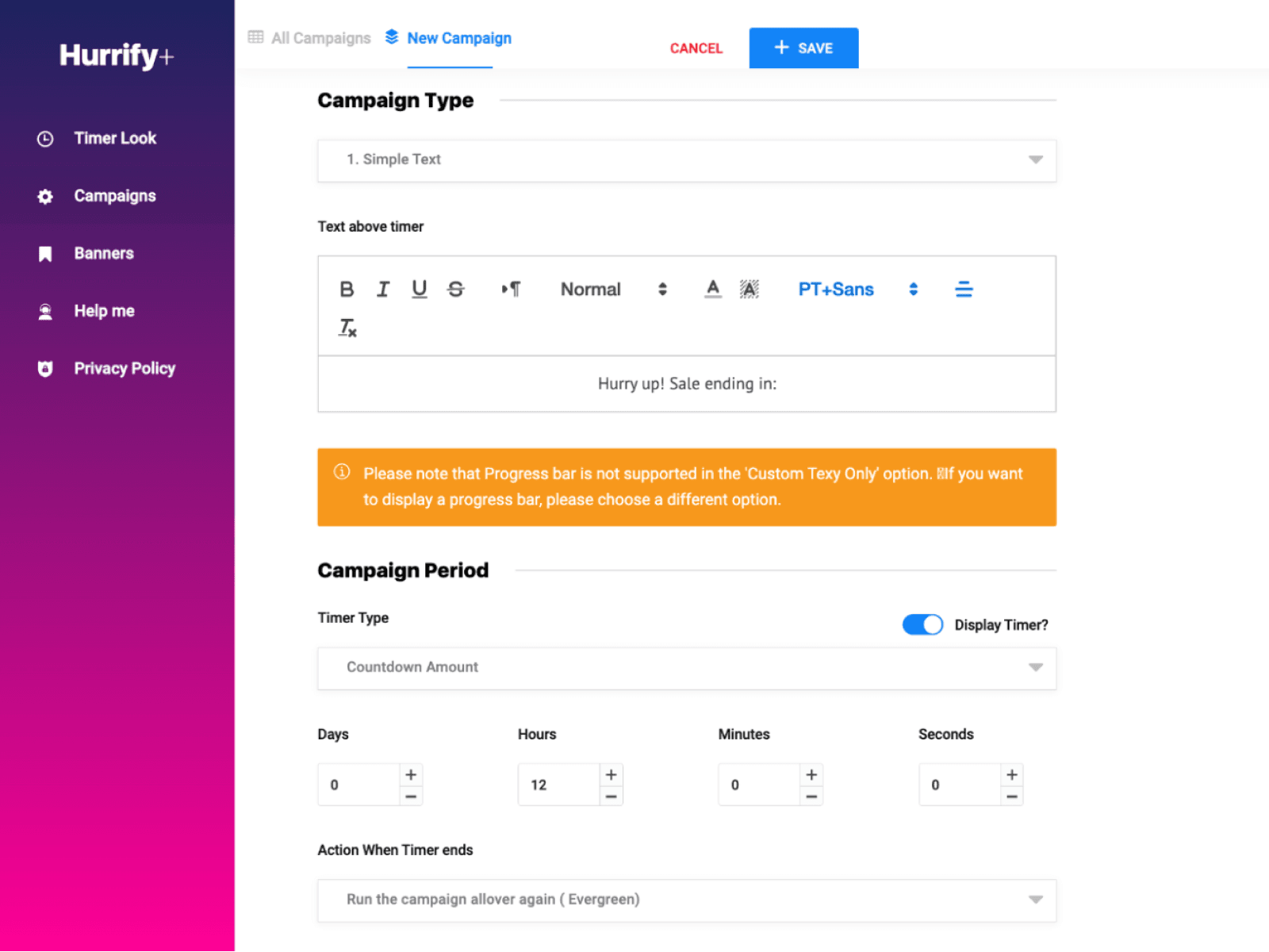
If you've ever visited an e-shop that had a big countdown right under the product name showing that in three hours the product will be 50% more expensive and you'd better hurry, someone was probably trying to catch you out with the fake-urgency dark pattern. The problem is that these countdowns are often set up so that when the time runs out, the countdown starts over and the discount thus practically never ends. As an example, I'm using an already-blocked extension previously available in the Shopify app, in which restarting the timer was even set as the default option.
What if the client wants a dark pattern?
Dealing with a request like "just bury it somewhere, I don't want people cancelling that subscription" can be tricky. The client has to understand that in the short term, using such a dark pattern may, for example, increase monthly sales, but in the long run it can harm the company far more. It's important to realize that users who move around the internet aren't stupid and often uncover the manipulation attempt, which can lead to a loss of trust in the service the client provides and a subsequent drop in revenue. In research by PwC, most of their customers stated that customer experience is one of the most important factors in their purchasing decisions. So it's in the client's interest to rather avoid dark patterns.
What should an ethical website look like?
There are many rules and guidelines; as an example I've picked these three from Humane by design:
- Users should have the right to know exactly what they're agreeing to when they choose to use a product. Clearly and specifically.
- Users should have access to the data you collect about them, and it should be easy to find.
- Deleting an account at the user's request, without any traces, should be a matter of course.
Sites worth visiting
deceptive.design/hall-of-shame – a curated list of companies that have been caught using dark patterns
reddit.com/r/darkpatterns – the freshest news from the community about what's currently happening on the web (and occasionally something to smile about)
x.com/darkpatterns – often interesting discussions not only about dark patterns
Intrigued? Check out the talk recording and share your experience, or drop by the next Ackee meets.
Further resources: