One of the most interesting parts of testing is working with design. Design testing, to me, means connecting technical details with how an app feels to the user. Even if an app works perfectly, poor alignment, wrong colors or unclear text can quickly ruin the first impression.
In this article we'll look at why UI testing is worth your attention, what to check during it, which tools have proven useful to me in practice, and why it pays off to occasionally put on your "user glasses".
Why do we test design?
At first glance it might seem that functionality matters more than an app's appearance. And it's true that a lot depends on the project context and the client's requirements – design isn't always the priority, and for internal systems, for example, appearance can be secondary.
But when we talk about the first impression, the UI plays a crucial role – it's the first thing the user sees. And a flaw in the appearance, whether it's poor alignment, a different shade of color or unreadable text, can quickly undermine trust in the app. As testers, we have the advantage of being able to catch these shortcomings before they ever reach the user.
What to check during UI testing
When testing the UI, I focus on several main areas:
- Colors – Does the implementation match the design? Do the colors have the right contrast?
- Layout – Are the elements aligned, with the right spacing and sizes? Is the execution "pixel perfect"?
- Texts – Are they free of grammatical errors, understandable, and using the correct font and size?
- Responsiveness – Does the design work correctly on all devices and screen sizes?
Tools that make our work easier
Figma
The basic place where everything starts. We can open the designers' mockups here and:
- measure distances between elements (cmd + option)
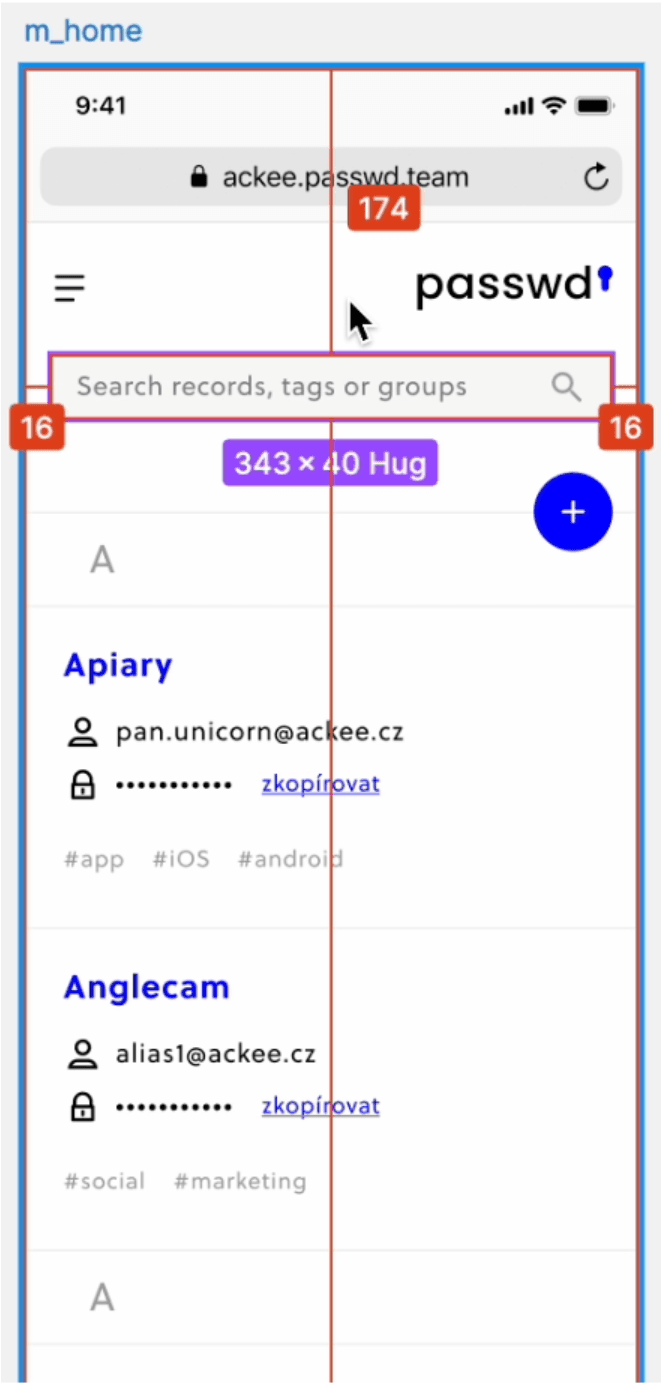
- check alignment and dimensions
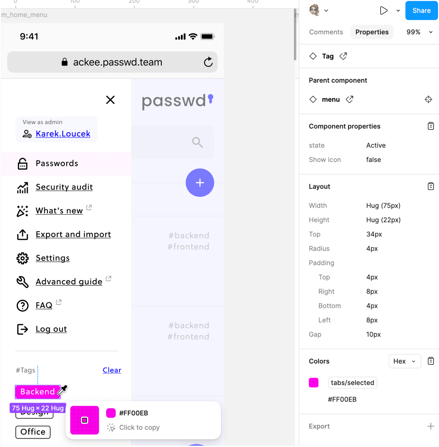
- read HEX color codes
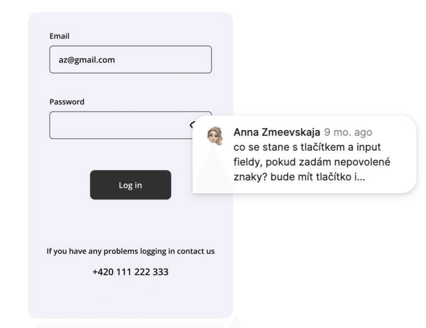
- use comments for feedback (don't forget to tag a colleague, otherwise they might not notice the comment)
DevTools
Developer tools serve as an invaluable helper for web apps:
- inspecting elements to check colors, fonts and dimensions
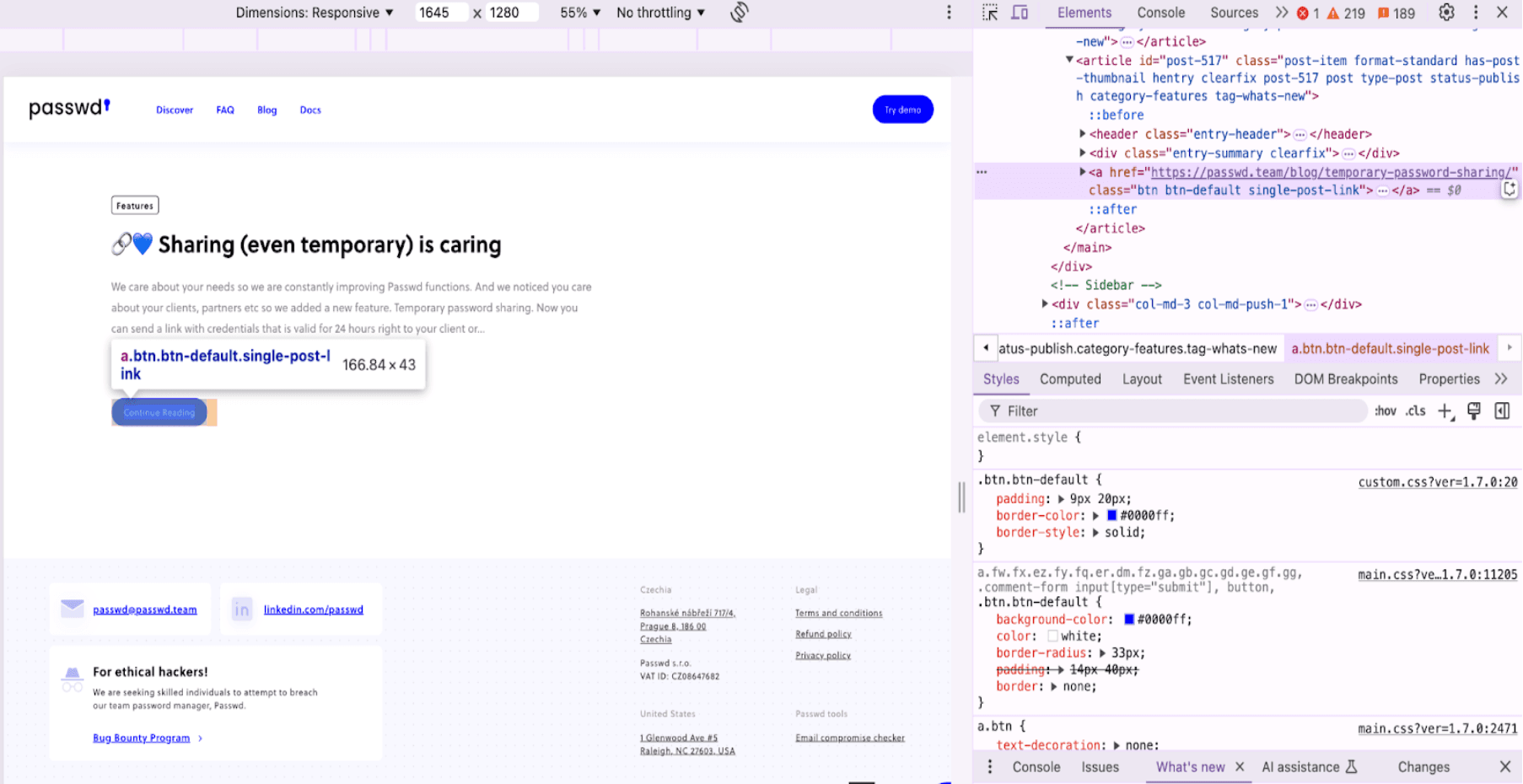
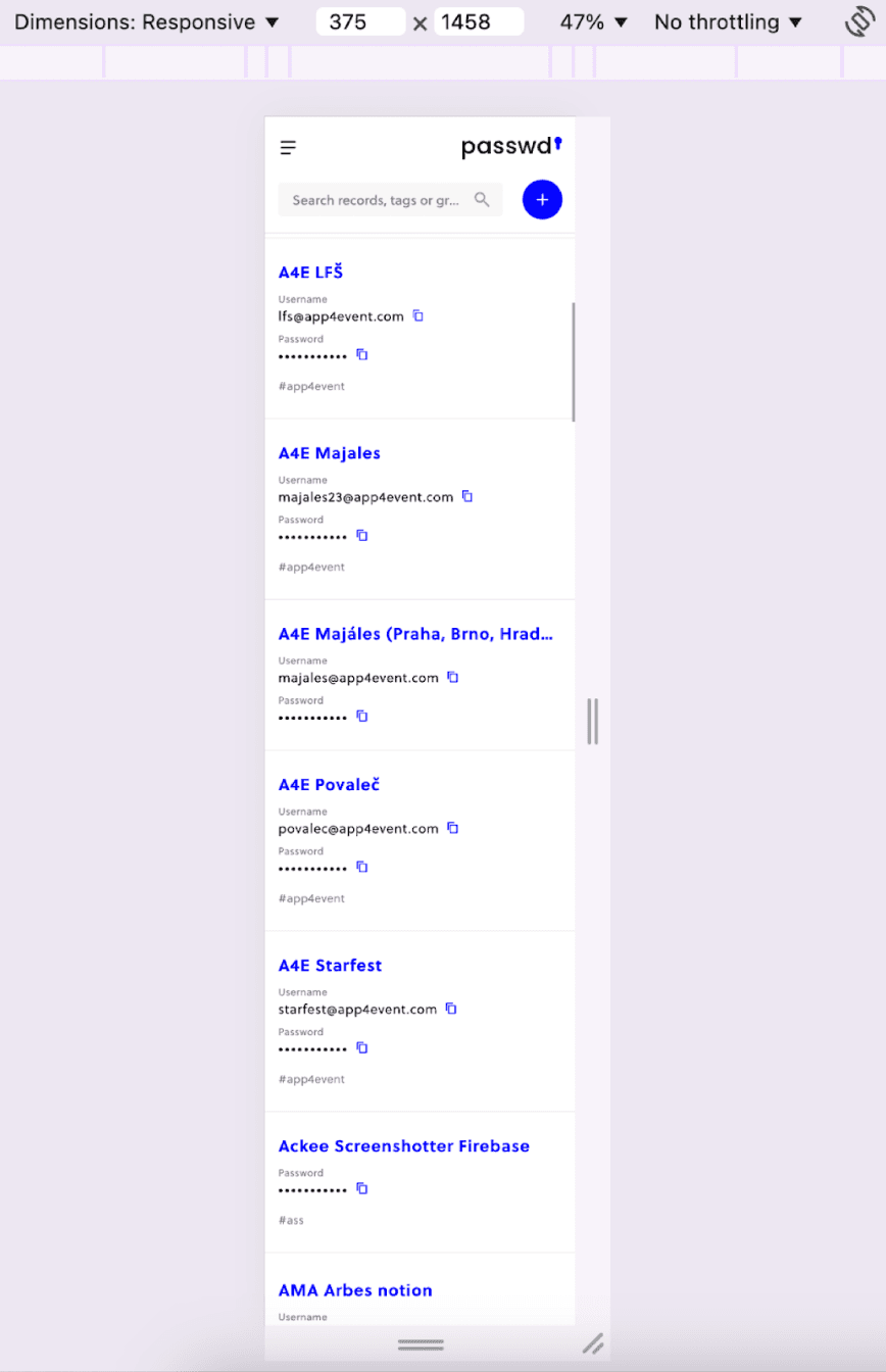
- setting a specific device size to test responsiveness
- comparing parameters with the Figma design
For mobile
On mobile apps we don't have as many tools as on the web, but there are handy helpers here too:
- Screen ruler – a simple tool for quickly measuring distances and checking element alignment
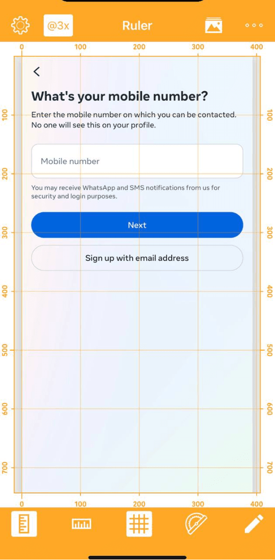
- Rocketsim (with Xcode) – for iOS simulators, where you can overlay and compare the design with the app, measure element positions, check colors and even test accessibility
Other useful helpers
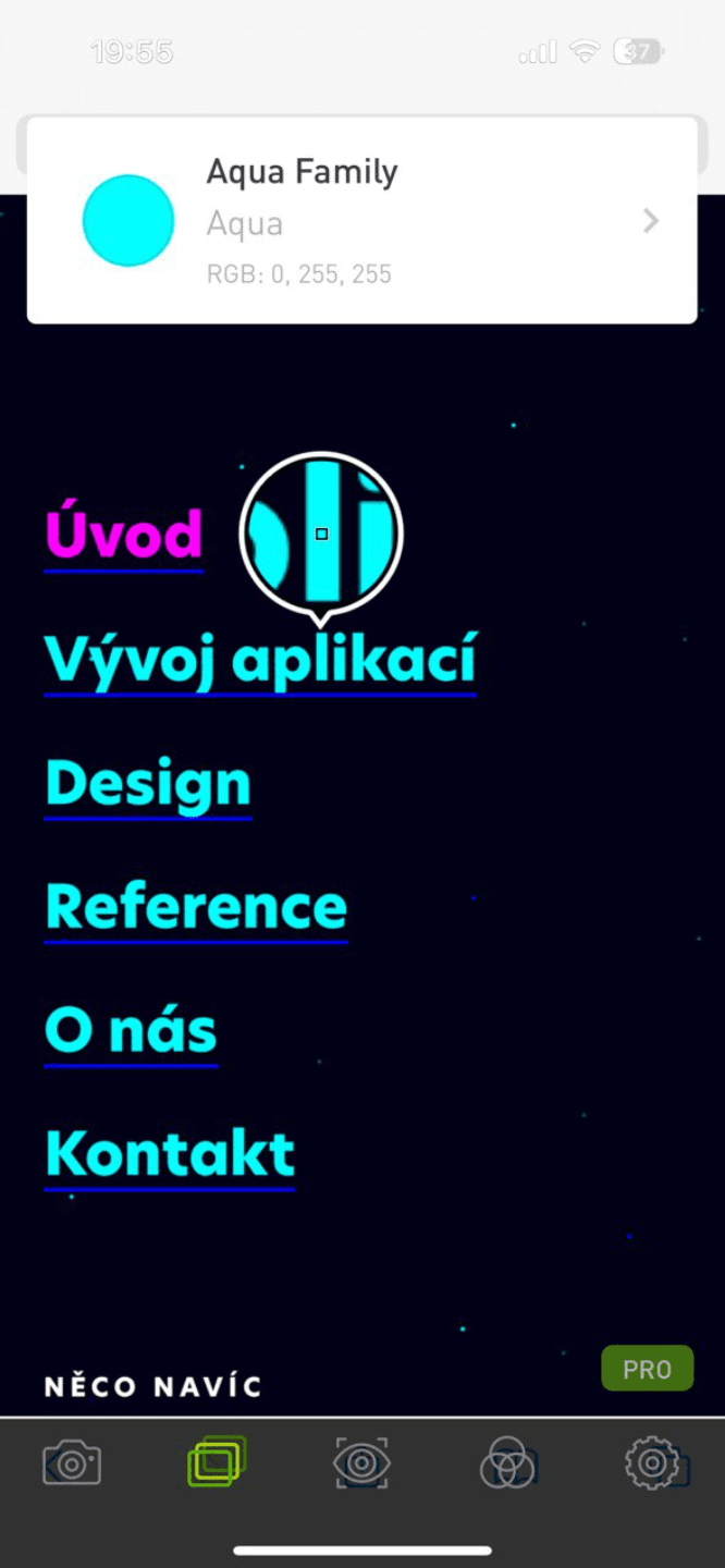
- WhatTheFont for identifying a font from a screenshot

Think like a user
Design testing isn't only about hunting for pixel deviations. What also matters is how the user perceives the app:
- Is the app easy to operate?
- Isn't the navigation too complicated?
- What could confuse the user?
- Does the app work for people with different needs too, for example for users with impaired vision?
It also pays off to test atypical scenarios like "What happens if I click here?" and to keep in mind users' varying levels of technical proficiency.
Design testing pays off
UI testing is a combination of technical diligence and empathy. The right tools and a "think like a user" approach let you uncover not just visual bugs, but also problems that could worsen the overall impression of the app and, with it, the user experience. And that's the added value we bring as testers: a product that not only works reliably, but also looks good and is a joy to use.