How do you unify a website, a customer portal, a mobile app, and other digital products into a single visual identity? For a major European energy player, we built a design system that helped establish a shared visual language across the entire ecosystem. In this article, we'll show how we approached it, what played a key role, and how we arrived at the solution.
From chaos to consistency
When different products within one ecosystem don't speak the same visual language, users notice very quickly. We often come across graphic components (buttons, for example) that look the same in different places but behave differently. Or colored text that is interactive in one place and merely a visual highlight in another, with no way to click through. So how do you deliver a high-quality and consistent user experience to the customer?
E.ON Energy came to us with exactly this challenge, having set out to unify all of its digital touchpoints on the Czech market – from the website through mobile apps to an information kiosk. The new visual identity came with a new visual language – let's call it neo-E.ON-ese – and our task was to teach products used by more than a million customers to speak it. But where do you start when there's so much of it?

How to tame the digital Babylon
You guessed it – the key is a well-designed design system. We took inspiration from the best-known ones, such as Material Design, IBM's Carbon Design System, the Atlassian Design System, Spotify's Encore, or the U.S. Web Design System. But what next?
Every language is built on an alphabet. We can think of it as a system of characters that create meaning in different combinations. So in Figma, we created our own basic set of elements, which we called the Core library (in other design systems you may come across names like Foundations or Brand essentials). Our Core library contained color scales, numeric values, typography, icons, and pictograms. In this article, though, we'll focus mainly on colors and numeric values.
Core library = the foundation of a design system
Colors are among the most important design elements, but on their own they aren't enough – they need a clearly defined function. Within the project, we therefore assigned specific uses to individual color scales. For example, red was reserved for interactive elements, while purple was used to visually highlight static parts. Thanks to this, colored text could no longer look clickable without actually being so.
For numeric values, we worked with multiples of four, which are a standard in the digital environment. We gave them clear functions too – for example for radius, spacing, or other dimensional properties.

Once we had this foundation laid out, we needed to build the library itself. Figma variables proved to be a great tool here – thanks to them, we created a clear database of values that worked as a single source of truth. The individual design systems and specific design files then connected to the Core library. We'll dig deeper into linking libraries and the communication between them some other time, perhaps.
The alphabet of a visual language
To create complex messages, we need words and sentences – that is, elements composed of individual characters. Those "words" in a design system can be pictured as basic components, such as a button. But for one to come into being, you need to combine colors, typography, and numeric values that determine radius, width, height, or padding.
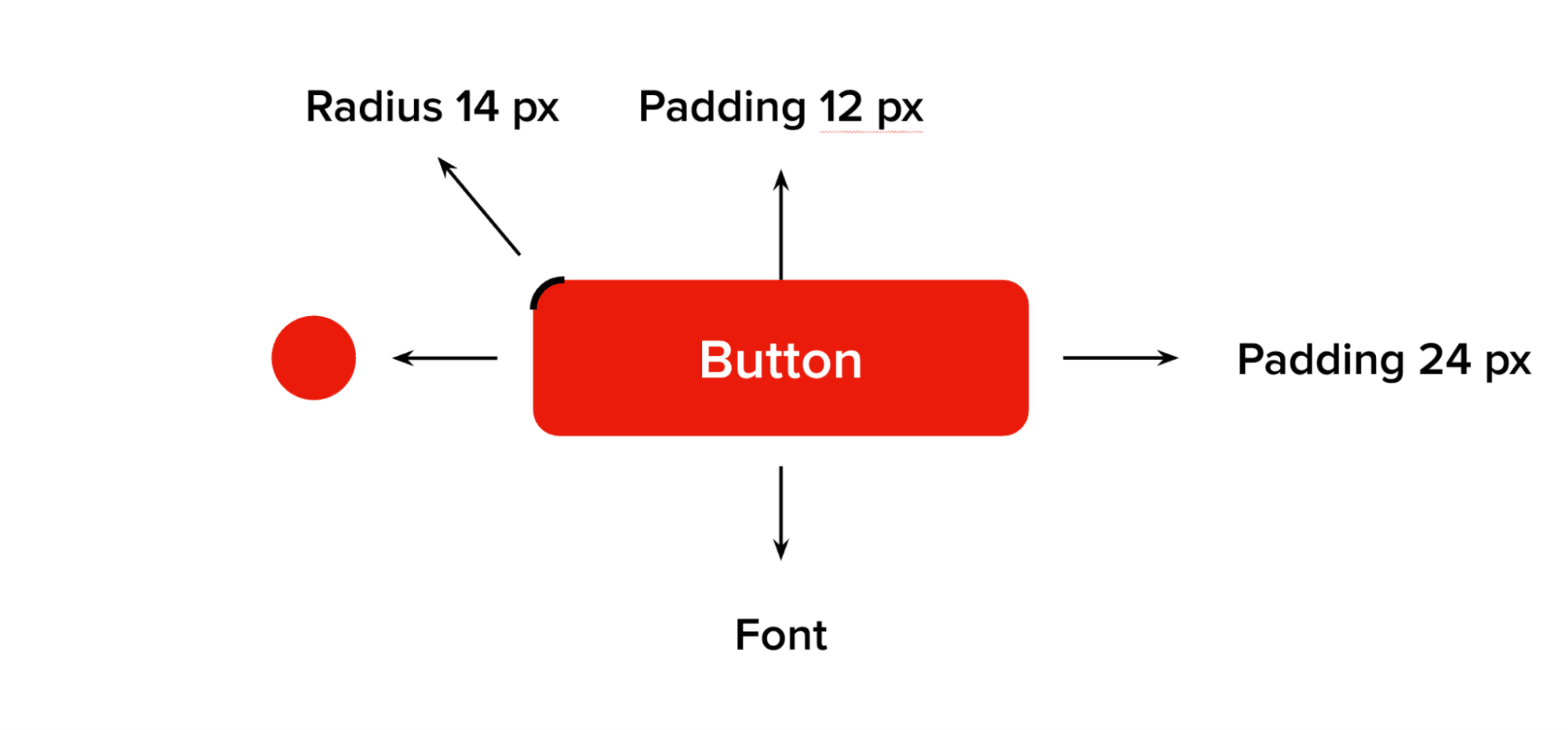
Just as words in a language occur in different forms, components need to account for their states as well, especially the interactive ones. From these basic components we can then assemble more complex units – so-called organisms. The result is a coherent design system that works as a dictionary of a shared visual language. The Core library then ensures the consistency of the entire project, because all the connected design systems draw from it.
The power of a shared visual language
Design is a language that lets digital products communicate with each other and with users, and it has a fundamental impact on the customer experience. Every button, color, or spacing says something – and if individual products "say" different things, the user notices and feels it very quickly. A design system is therefore not just a tool for designers, but an effective way to create a shared voice across an entire digital ecosystem and a consistent user experience.

Thanks to a clearly defined Core library, we were able to lay solid foundations on which individual products can keep growing without losing quality and consistency. Each of them keeps its functionality and context, but they all speak the same visual language – clearly, predictably, and without unnecessary misunderstandings. Taming the digital Babylon thus doesn't mean suppressing differences, but giving them clear rules. And that's exactly where the power of a well-designed design system lies.